
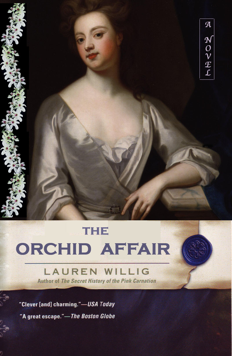
But I digress. The big excitement today was that the cover art for the new book, The Orchid Affair, was unveiled on Willig's website. Previous Pink book covers were comprised of painted portraits from the eighteenth and nineteenth centuries, giving the books a romantic but distinctly historical feel. Imagine my shock when I saw that the cover for The Orchid Affair not only sports a new, Romance Novel curlicue font but has replaced the fine arts portrait with a contemporary (original) photo-realistic drawing of a bare shouldered, headless woman:

Sure, it's pretty, but, as a friend remarked, all that's missing is Fabio and his flowing locks. To me, this doesn't say historical novel featuring espionage, quizzing glasses, and a dash of romance, it says Generic Trashy Bodice-Ripper featuring either a weak-willed, wilting flower or an overly-pugnacious firebrand and the requisite rugged, brutish male. Without, I hope, being flippant or overly critical, this cover looks cheap and down-market. (A scan of the comments on her site showed that I was not alone in these sentiments.) It also looks a bit...how to say this correctly...unsophisticated? Unintelligent? It's the kind of cover I wouldn't want people on the subway to see me reading.
And that's just not who Lauren Willig is, nor is it what her books are. (Let me be clear: this is not meant to be a critique of Willig, who stated on her site that the makeover decision was made by her publisher. She is fabulous.)
More to the point, several commentors on Willig's site said that if they did not already know her work and saw this cover in the store, they would pass right by it. Would I do the same? Probably. Would you? To borrow from Carrie Bradshaw, I couldn't help but wonder to what extent we judge a book by its cover. What kind of assumptions do we make about a book's content based on its outward appearance? If, for example, the heroine's shoulders were covered, would I assume the content was more "elevated?"
A cover is a book's calling card. Like an actor's headshot or a job applicant's resume, it is the first thing we see and what we use to form a first impression. We expect a headshot/resume/cover to tell us something about who or what the person/book represented is and what they're about. My thespian brother recently told me about a friend of his whose choice of clothing in his headshot had typecast him in the stereotypical "Asian" roles--doctor, scientist, lab tech (thanks, America...). This friend is actually a very fine actor with a tremendous dramatic range, but the way in which he presented himself on his calling card meant that directors formed a very narrow, rigid picture of him, with the result that they never saw his other talents.
So what does The Orchid Affair's cover say to me? The fountain in the background, writing in the sky, and blue palette suggest that the overall mood of the book will be contemplative, sentimental, and chick-lit-y (but not as much as pastels/pink). Let's assume the woman depicted is the main character. The lack of face shifts the focus away from her psyche and onto her body. That her dress appears to be slipping from her shoulders further emphasizes her sexuality and promises the reader lots of seduction but, probably, not much plot, certainly not a complex one. In addition to presenting the main character as a Body rather than as a Person, the lack of a face also allows her to function as an avatar for the reader, who can insert herself in her place and, through her, live out the romantic fantasies that cannot be fulfilled in her real life. The flower she holds promises romance (so not just ravishing) and probably a happy, matrimonial ending.
Now, if you know Lauren Willig's books, you know that they are so much more than that. This heroine, for example, happens to be a smart, educated girl--a governess and a trained spy--and the plot goes beyond heaving bosoms to include espionage, double agents, and a Royalist conspiracy. But, based on this cover, who could tell?
Being the photoshop wiz (read: total novice) that I am, I decided to try my hand at cover designing and see what I could come up with in the fine arts genre. These are my two best:

Compare these two to the official cover: which one would you be more likely to pick up? Why? What different conjectures would you make about the plot? What kind of book would you think it was?
It is frustrating that the good people at Dutton decided that Willig's books need to appeal to the lowest common denominator in order to be successful. This kind of thing happens a lot: much has been made recently, for example, about the Brooklyn Museum's unsuccessful attempt to boost attendance through making themselves more "popular." Guess what? It doesn't work. When you don't trust your audience, when you say "oh, you couldn't possibly like or understand all this stuffy Art and Literature--it's so dry and complicated and you have to Think. Look at this picture of Mick Jagger or watch Twilight instead," when you say that, you not only alienate the part of your audience that wants art and literature, you ensure that the other part of your audience won't even give it a chance. By dumbing down your content, you dumb down your audience. Why should anyone even buy a book if reading is just So Hard?
I also think it's frustrating and sad that, in today's publishing world, the author--the generator of the product--has so little say in how that product is presented. As I noted above, Willig says on her site that she would have preferred to stick with the fine art covers. An earlier news post reveals that the change in the title format (the original title was The Intrigue of the Silver Orchid, mirroring the other titles in the series) was instigated by her editors as well. Now, I grew up with two parents who were book editors, so I know how tricky the world of book publishing is. But surely the creator of the work should have more say in what it's called and what it looks like? And why the sudden need to "makeover" a series that regularly appears on the bestseller list? That, however, is a subject for another entry.
Of course I will buy, read, and love The Orchid Affair and all the other books that Willig puts out. But I'm still really disappointed that my beloved Advanced Escape Reading (bodices AND bibliographies, bitches) has been re-branded as trashy romance.
Your thoughts?
No comments:
Post a Comment